 COLOR THEORY + COLOR WHEEL STILL LIFEHappy Monday Wildcat Artists! I hope your weekend was swell and that you all had a happy Easter, blessed Ostara, blissful Ram Navmi and are enjoying Passover - Chag Pesach Sameach! I wish you well in every spiritual way you are celebrating the Spring season. With the season of Spring upon us plants and animals will emerge from their Winter slumber and the warming weather will bring blooming trees and flowers and baby animals and LOTS OF COLOR! What is COLOR THEORY? Some of you may be more familiar with this concept than others – whether it is a review or new information we are going to have fun with it. I have listed our Art Vocabulary for today... I know the list seems like a lot but try to not feel overwhelmed. Once we go through them and you watch the videos it will all make sense. And if they are not making sense re-read or re-watch and email me with questions and/or I am happy to meet with you virtually to chat about Color Theory. ART VOCABULARY – become familiar with these terms:
 COLOR THEORY Color theory is both the science and art of using color and is a term used to describe the collection of rules regarding the use of color in art and design. In the visual arts, color theory is a body of practical guidance to color mixing and the visual effects of a specific color combination. It explains how humans perceive color; and the visual effects of how colors mix, match or contrast with each other. Color theory also involves the messages colors communicate; and the methods used to replicate color.
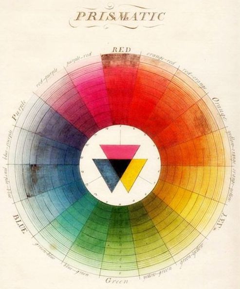
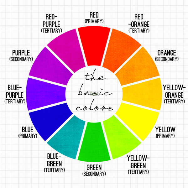
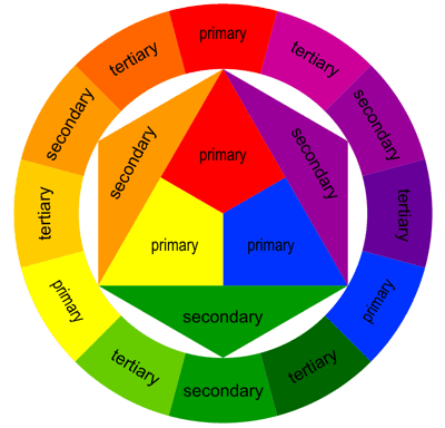
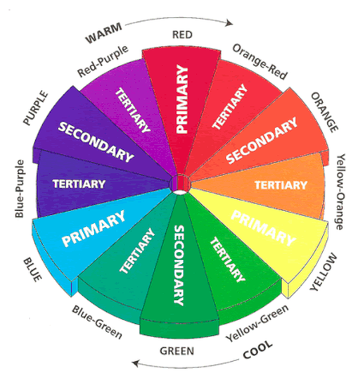
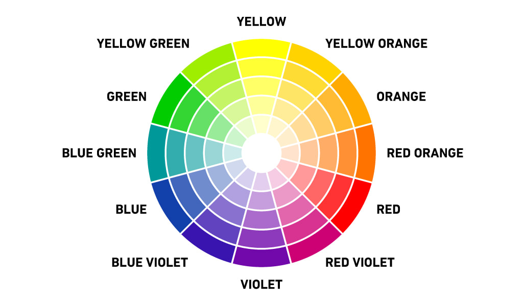
 A COLOR WHEEL or Color Circle is an abstract illustrative organization of color hues around a circle, which shows the relationships between primary colors, secondary colors, tertiary colors etc. A Color Wheel has Radial Balance, based on a circle with its design extending from the center. A star, the iris around each pupil of your eyes, a wheel with spokes, pizza, and a daisy (among many flowers and other plant forms) are examples. >>> The Color Wheel we use has 12 colors <<< |
 |  |
COLOR TEMPERATURES
Draw a line through the center of the wheel, and you’ll separate the warm colors (reds, oranges, yellows) from cool colors (blues, greens, purples).
Warm colors are generally associated with energy, brightness, and action, whereas cool colors are often identified with calm, peace, and serenity.
Warm colors are generally associated with energy, brightness, and action, whereas cool colors are often identified with calm, peace, and serenity.
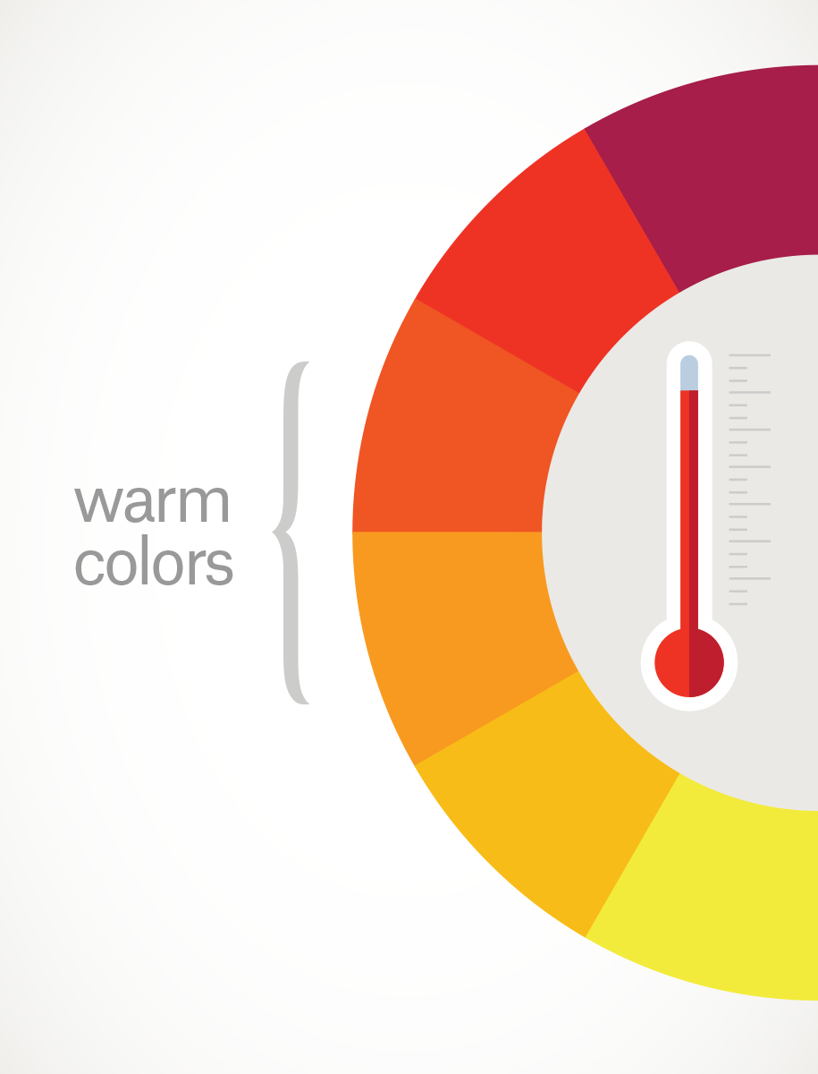 | WARM COLORS The phrase warm color is used to describe any color that is vivid or bold in nature. Warm colors are those that tend to advance in space and can be overwhelming. Examples of warm colors include red, yellow and orange (think exciting fire and volcanoes). |
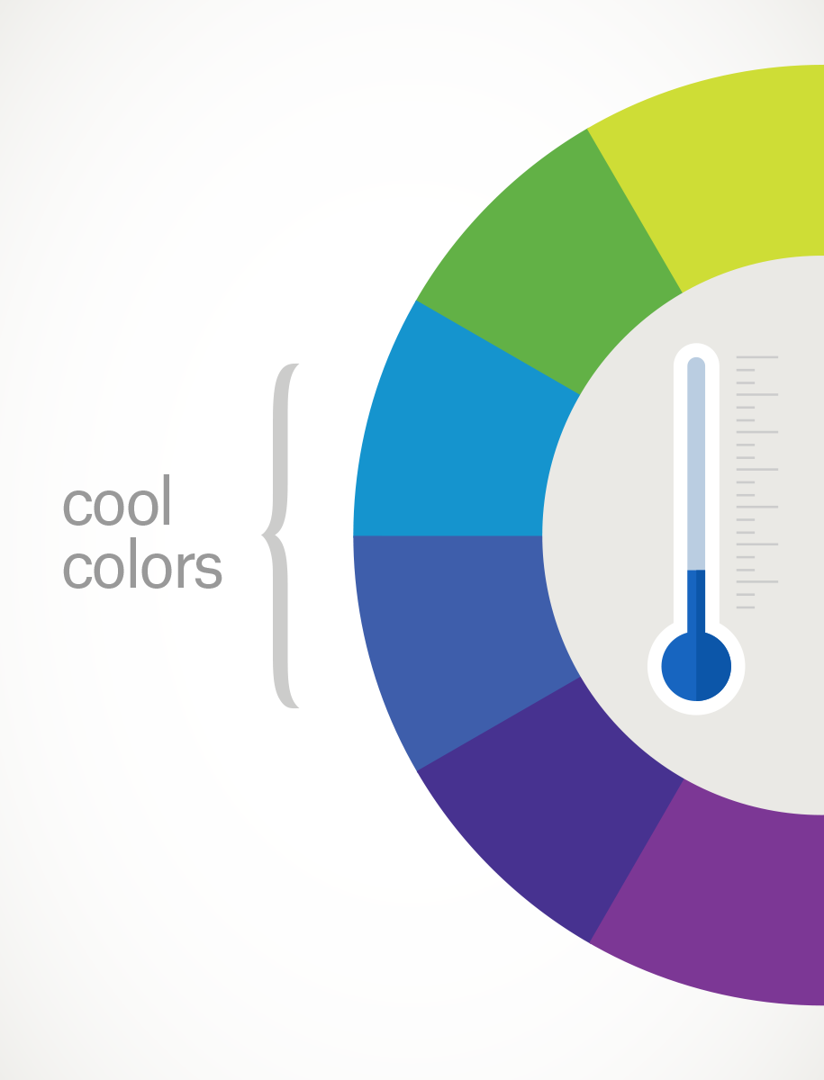 | COOL COLORS The phrase cool color is used to describe any color that is calm or soothing in nature. Cool colors are not overpowering and tend to recede in space. For this reason, cool colors typically make a space seem larger. Examples of cool colors include green, blue and violet (think calming blue waters). |
A COLOR SCHEME is used to describe the overall selection of colors in an artwork. The major color schemes in art are analogous, complementary, split-complementary, triadic, rectangular and monochromatic. These color schemes utilize colors at certain locations on the color wheel.
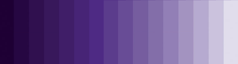
Monochromatic Color Scheme = containing or using only one color.
Monochromatic color schemes are derived from a single base hue and extended using its shades, tones and tints. Tints are achieved by adding white and shades and tones are achieved by adding a darker color, grey or black.
Monochromatic color schemes are derived from a single base hue and extended using its shades, tones and tints. Tints are achieved by adding white and shades and tones are achieved by adding a darker color, grey or black.
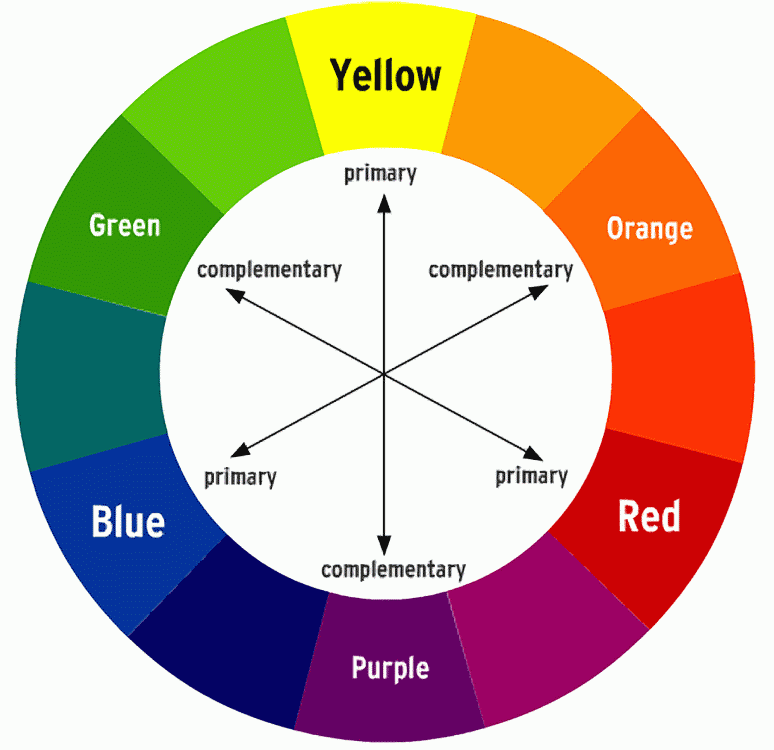
Complementary Color Scheme = colors which are directly opposite each other, such as red and green. Complementary colors can make each other appear brighter = POP, they can be mixed to create effective neutral hues, or they can be blended together for shadows.
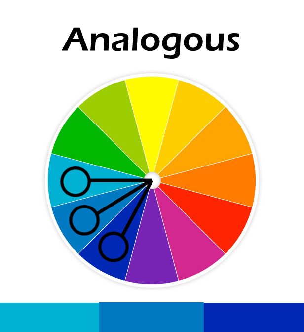
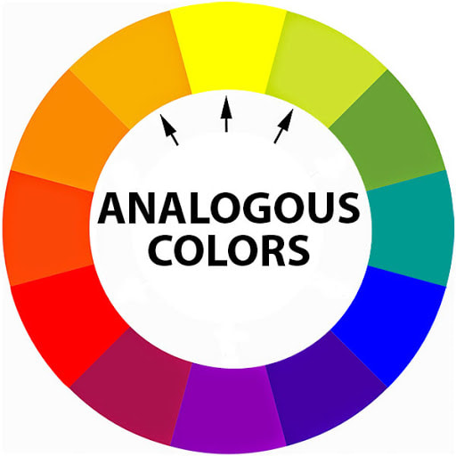
Analogous Color Scheme = any one of a group of three colors that are next to each other on the color wheel. Red, red-orange/vermillion, and orange are analogous colors.
 |  |
Hue = name of color
Saturation = intensity or purity of a hue
Value = degree of lightness/darkness of a hue
Shade = hue produced by adding black
Tint = hue produced by adding white
Tone = hue produced by adding gray
Saturation = intensity or purity of a hue
Value = degree of lightness/darkness of a hue
Shade = hue produced by adding black
Tint = hue produced by adding white
Tone = hue produced by adding gray
WATCH THE TWO SHORT VIDEOS
BELOW BEFORE READING ON!
Have your sketchbook, journal or notebook handy for notes!
Color Theory for Noobs | Beginner Guide
Color Theory Basics
ASSIGNMENT: assemble your own color wheel!
There are two ways this Art Mission can be accomplished - choose!
See slide show examples following these instructions:
With either method of construction you are to use Radial Balance to organize your objects into a circle or draw out a circle and divide your Color Wheel to tape/glue down your magazine/paper cut outs.
- Still Life
- Collage
See slide show examples following these instructions:
With either method of construction you are to use Radial Balance to organize your objects into a circle or draw out a circle and divide your Color Wheel to tape/glue down your magazine/paper cut outs.
>>> YOU MUST INCLUDE ALL 12 COLORS <<<
PRIMARY COLORS
1. Red
2. Yellow
3. Blue
SECONARY COLORS
4. Orange
5. Green
6. Purple
TERTIARY COLORS
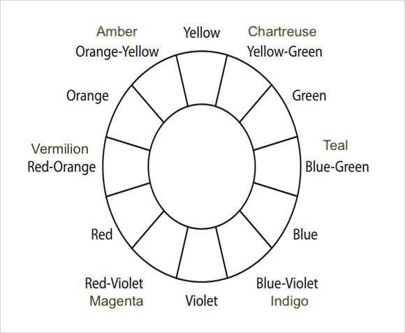
7. Red + Orange = Vermillion (red-orange)
8. Orange + Yellow = Amber (yellow-orange)
9. Yellow + Green = Chartreuse (yellow-green)
10. Green + Blue = Teal (blue-green)
11. Blue + Purple = Violet (blue-purple)
12. Purple + Red = Magenta (red-purple)
*** HINT = Start with the Primary colors - red, yellow, and blue.
1. Red
2. Yellow
3. Blue
SECONARY COLORS
4. Orange
5. Green
6. Purple
TERTIARY COLORS
7. Red + Orange = Vermillion (red-orange)
8. Orange + Yellow = Amber (yellow-orange)
9. Yellow + Green = Chartreuse (yellow-green)
10. Green + Blue = Teal (blue-green)
11. Blue + Purple = Violet (blue-purple)
12. Purple + Red = Magenta (red-purple)
*** HINT = Start with the Primary colors - red, yellow, and blue.
>>> YOU MUST HAVE AT LEAST 3 OBJECTS OR MAGAZINE CUTTINGS FOR EACH COLOR <<<
STILL LIFE which you remember from last Monday Art Mission
A Still Life is a work of art depicting mostly inanimate subject matter, typically commonplace/everyday objects which are either:
1. Natural/Organic: food, flowers, dead animals, plants, rocks, shells, etc.
2. Man-made/Artificial: drinking glasses, books, vases, jewelry, coins, pipes, etc.
A Still Life is a work of art depicting mostly inanimate subject matter, typically commonplace/everyday objects which are either:
1. Natural/Organic: food, flowers, dead animals, plants, rocks, shells, etc.
2. Man-made/Artificial: drinking glasses, books, vases, jewelry, coins, pipes, etc.
COLLAGE
- from the French: coller, "to glue" or "to stick together"
- is a technique of art creation, primarily used in the visual arts, but in music too, by which art results from an assemblage of different forms, thus creating a new whole
- a piece of art made by sticking various different materials such as photographs and pieces of paper or fabric on to a backing.
WHEN YOU ARE FINISHED
QUESTIONS
I look forward to seeing what you all come up with and be sure to check back for WEDNESDAY WATCH!
Hopefully the weather clears up soon and we may be able to do some ‘outdoor art’ – in the meantime make sure you are taking good care of yourselves and remember I am an email away if you need help with anything.
All best,
Nicole Webster Clark
- Take a picture – try a few angles and have good lighting
- Email me the image [email protected]
- Include the answers to the questions below in the body of the email
QUESTIONS
- What was the easiest color for you to find?
- What was the most difficult color for you to find?
I look forward to seeing what you all come up with and be sure to check back for WEDNESDAY WATCH!
Hopefully the weather clears up soon and we may be able to do some ‘outdoor art’ – in the meantime make sure you are taking good care of yourselves and remember I am an email away if you need help with anything.
All best,
Nicole Webster Clark
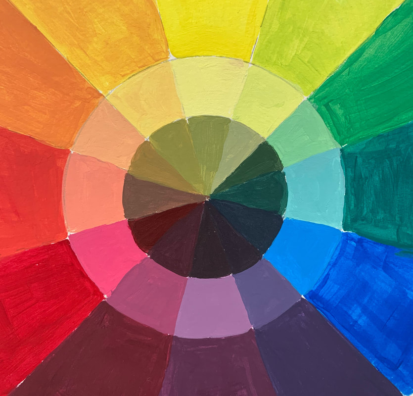
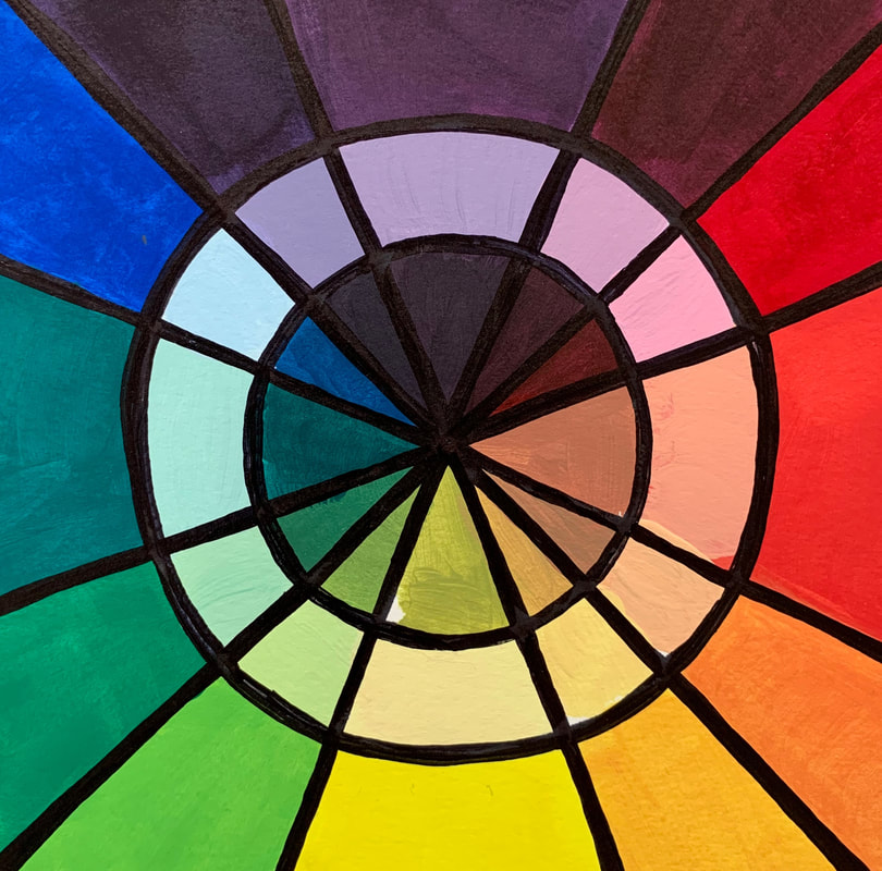
If you have acrylic paints and brushes at home and want to attempt a color wheel on your own here is a link to show you how! I recommend you watch the entire video first then start it over when you are ready to begin - get set up and follow along.
Take your time and pause the video and rewind when necessary.
I have also attached examples and templates for you to refer to.
Take your time and pause the video and rewind when necessary.
I have also attached examples and templates for you to refer to.
Video on Mixing Acrylic Paint
0 Comments
Leave a Reply.
Nicole
Webster
Clark
Visual + Fine Art Educator
Mixed Media Visual Artist
 RSS Feed